
Building a stand-alone application for servicing policies.
Redesigning LifetimeService
Sureify
Sureify modernizes life insurance by helping companies better serve and sell to their customers.
As Staff Product Designer, I led key projects including the product vision for our LifetimeService Application. During my tenure, the company scaled dramatically—from 30 to 300 employees, 1 to 10 designers on my team, and revenue from under $100K to over $15M.
LifetimeService
LifetimeService encompasses a comprehensive suite of self-service features, allowing policyholders to view and update their policies online without requiring call center support.
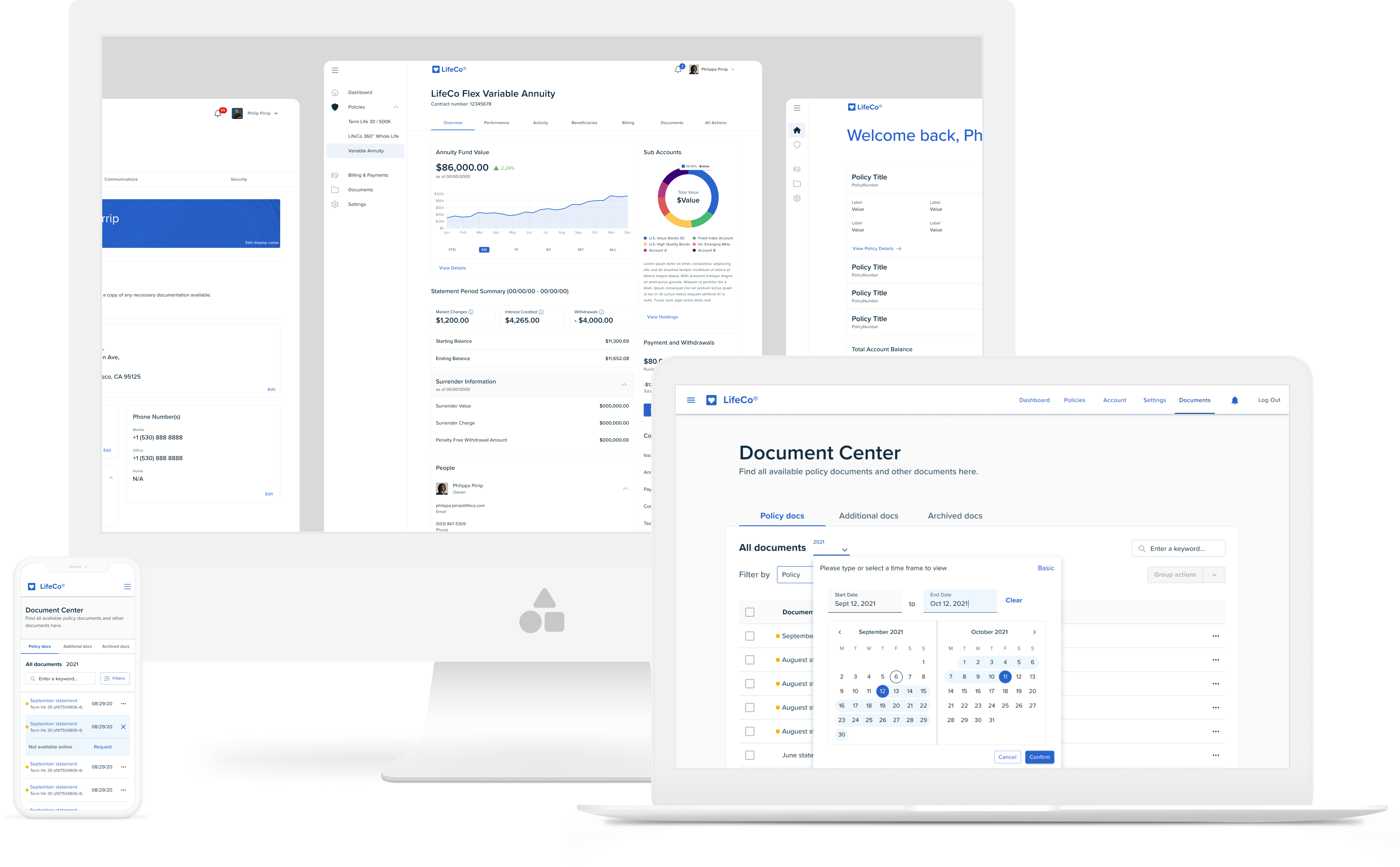
Collection of updated service screens across multiple devices.
Project Details
Problem
Traditionally, policy changes required agents and paperwork, creating slow, frustrating experiences. Insurance companies excel at risk management, not software development, so they partner with third-party providers to serve today's tech-savvy customers.
Objective
Transform our self-service tools into a standalone white-label product that carriers can offer their customers, making policy management easier for everyone.
Overview
Background
Sureify started with LifetimeEngage, an app combining educational content, health tracking, and communication between insurers and customers.
We added LifetimeService to let policyholders manage their policies online, but limited carrier system access forced us to scale back our original vision.
Our first version kept things simple—read-only policy data in a dedicated section alongside educational content. As we gained better system integration and expanded features, we realized the product needed a major redesign.
Initiation
Insurance companies loved connecting directly with customers, but had different needs. Large insurers wanted health tracking and educational features, while smaller ones preferred a simple policy management tool.
The pandemic created urgent demand for digital policy management as social distancing made traditional service methods impractical. This pushed us to rethink our entire service product.
I led the project to redesign our service features into a standalone application that could work independently or alongside our engagement app.
Discovery

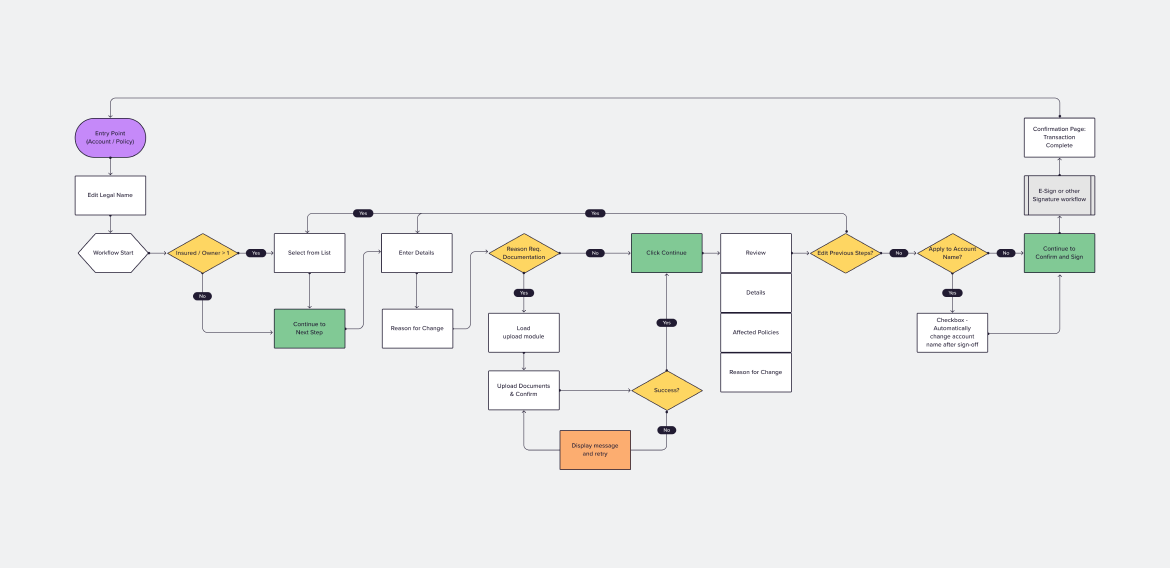
Process diagram to present to stakeholders how we would approach fleshing out a perspective for the standalone service functionality.
Establishing a Feature Matrix
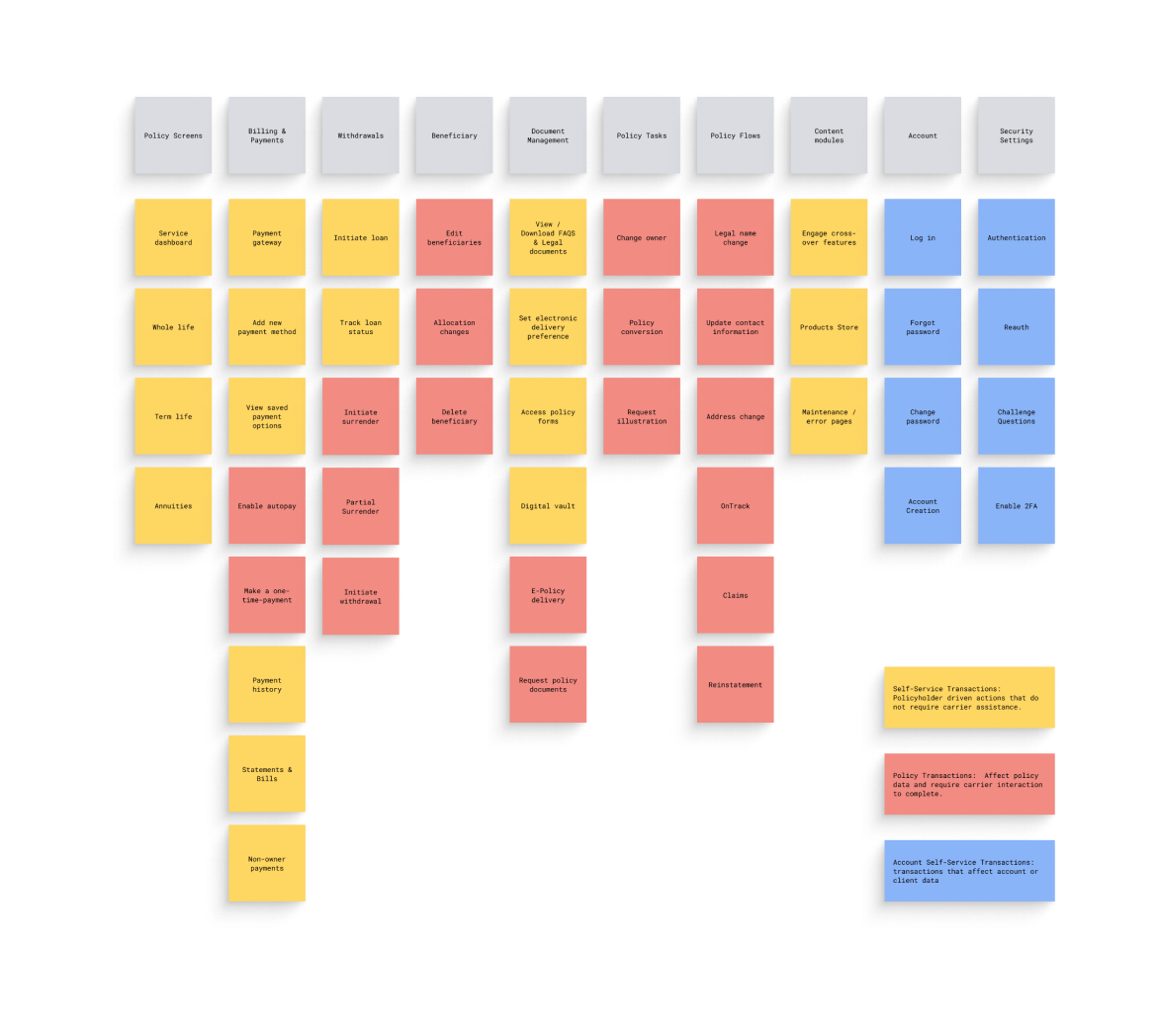
I focused on understanding customer needs and industry best practices to build a comprehensive solution. Working with our CEO and product manager, we created a feature matrix to track what functionality to include and monitor development progress.
Research Initiative
I worked with designers Ruping and Patrick to research competitor products. We analyzed policyholder interfaces across the industry and assessed them against our feature requirements.
Our current product had major gaps—it offered only 12 of the 60 essential transactions customers needed, covering just a quarter of full servicing functionality.
Distilling Research into Patterns
We collected screenshots from each product and identified common patterns to understand industry standards. This helped us design better workflows and policy displays while spotting where insurance-specific patterns differed from standard UX practices—letting us decide when to follow or challenge conventions.
Definition
Audience
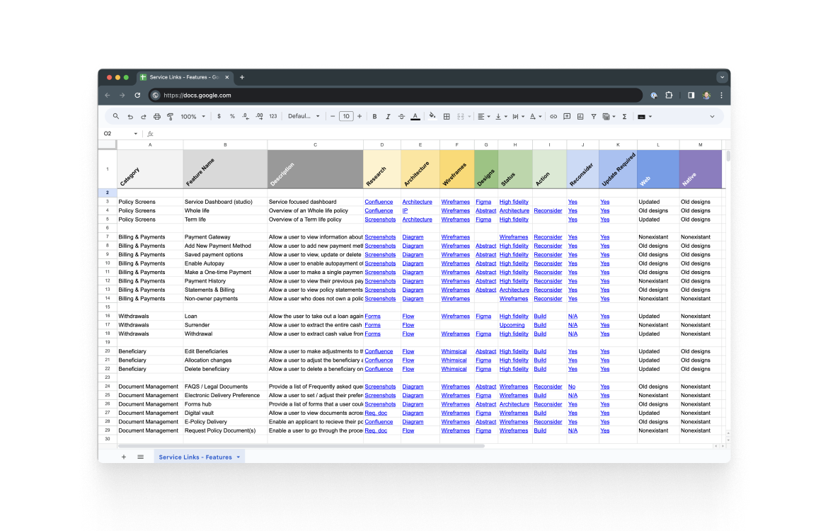
Prioritizing Workload
We used this research to conduct expert interviews, which confirmed some assumptions (like user access) while disproving others (like our document management approach). A simple scoring system helped us prioritize features based on complexity and development time.
The research led to two key insights: what functionality to build and the need to standardize our design language across all products.
Design
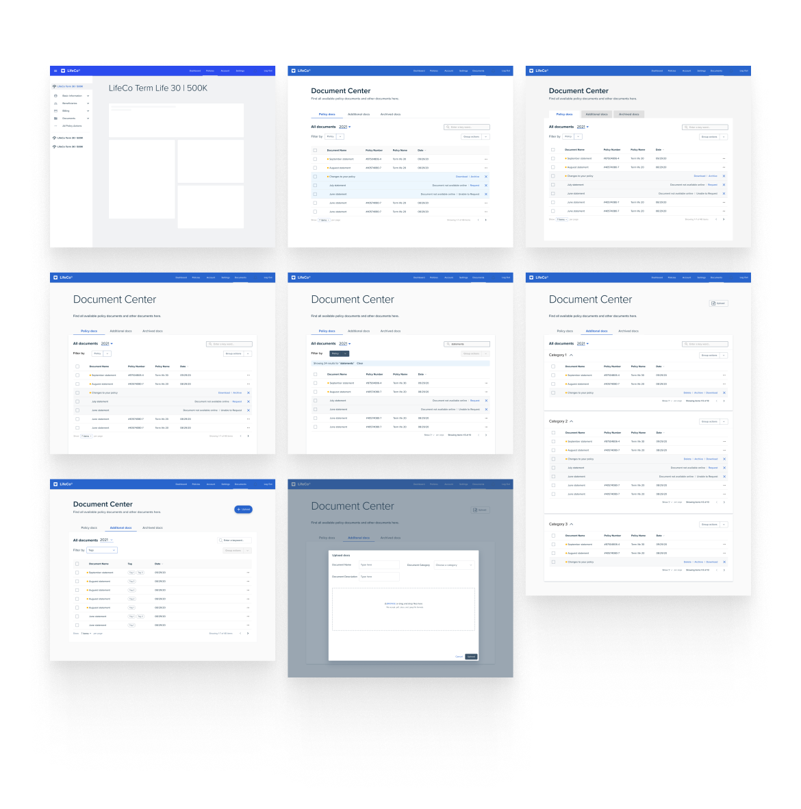
Concept UI to Elicit Feedback
Ruping and I created initial designs for the servicing features, then refined them through multiple reviews with subject matter experts to better understand carrier systems.
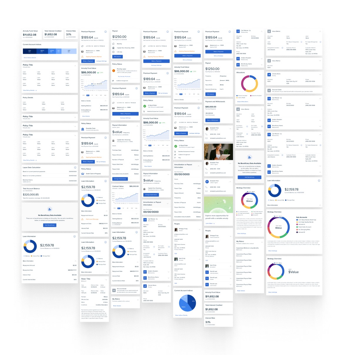
Modularity
We designed modular components that could be mixed and matched to meet different carrier needs, letting us create custom experiences without rebuilding from scratch each time.
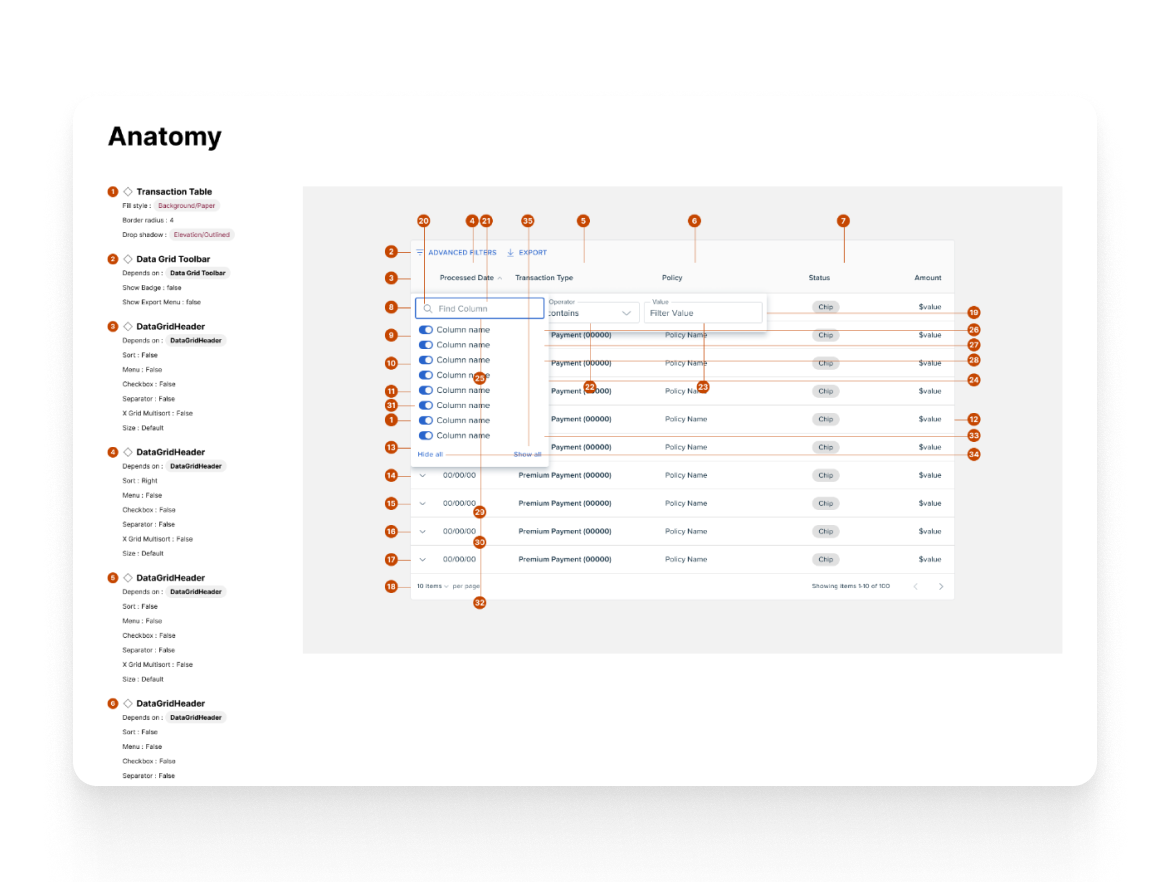
Highlights
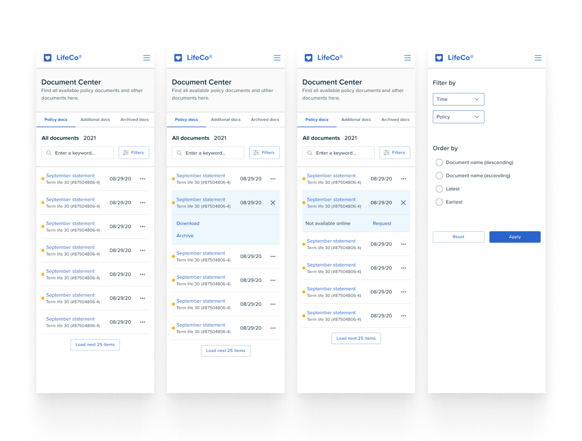
Document Center
A hub where policyholders can access policy documents, insurance forms, and track all uploaded and delivered files.
Policy display
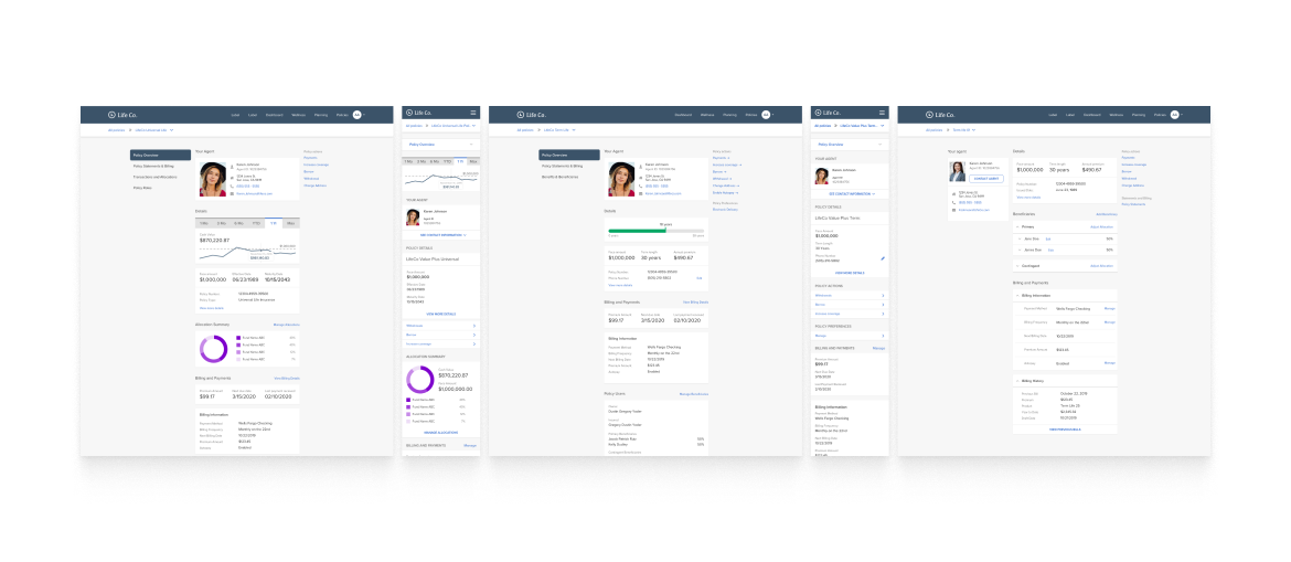
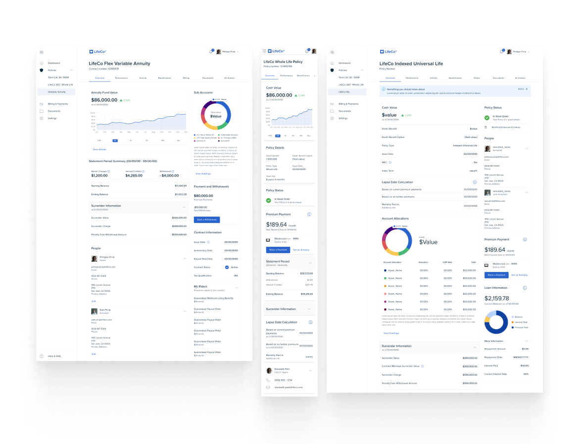
We reorganized information to be clearer and more modern, adding visual elements like graphs and charts for policy data. We also updated the UI for consistency across all products.
Transactions
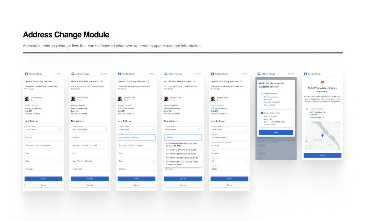
When we launched the updated LifetimeService, we found each carrier had different transaction needs. We needed a flexible system to handle these variations.
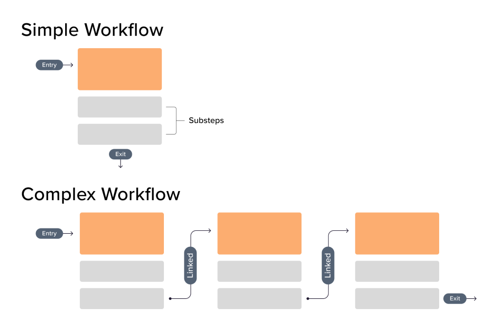
Patrick, our CTO Ben, and I analyzed agent and policyholder workflows to identify overlaps and differences. Through whiteboard sessions, we created "Journeys"—a flexible transaction model.
Journeys used modular "blocks" that could adapt to different policyholders, states, policy types, and other variables. This let us build complex workflows from simple components and customize flows much faster.
Carriers also wanted to combine multiple transactions into single Journeys, removing the need to submit separate forms at each step.
Impact
Standalone Service Application Developed
Our feature matrix and design assets gave the engineering team a clear development roadmap. The standalone service application we built also let our sales team preview the product with potential clients.
This strategic vision helped secure several carrier partnerships and streamlined requirements gathering—having most functionality already built meant we could quickly customize for each carrier's specific needs.
Using modular, component-driven design, we went from concept to stable product in under twelve months. LifetimeService quickly outperformed our original product, helping increase our carrier client base by over 300%.

Interested in working together? Contact me!
© Anders Houston 2024
