
Fine tuning the Direct-to-Consumer purchasing experience.
Revamping LifetimeAcquire
Sureify
Sureify modernizes life insurance by helping companies better serve and sell to their customers.
As Staff Product Designer, I led key projects including the direct-to-consumer quote and application product. During my tenure, the company scaled dramatically—from 30 to 300 employees, 1 to 10 designers on my team, and revenue from under $100K to over $15M.
LifetimeService
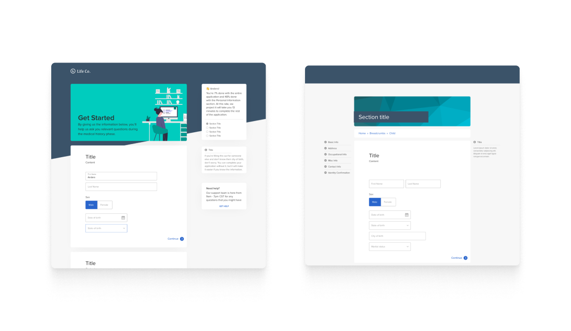
LifetimeAcquire lets insurance companies sell policies directly to consumers online without agents.
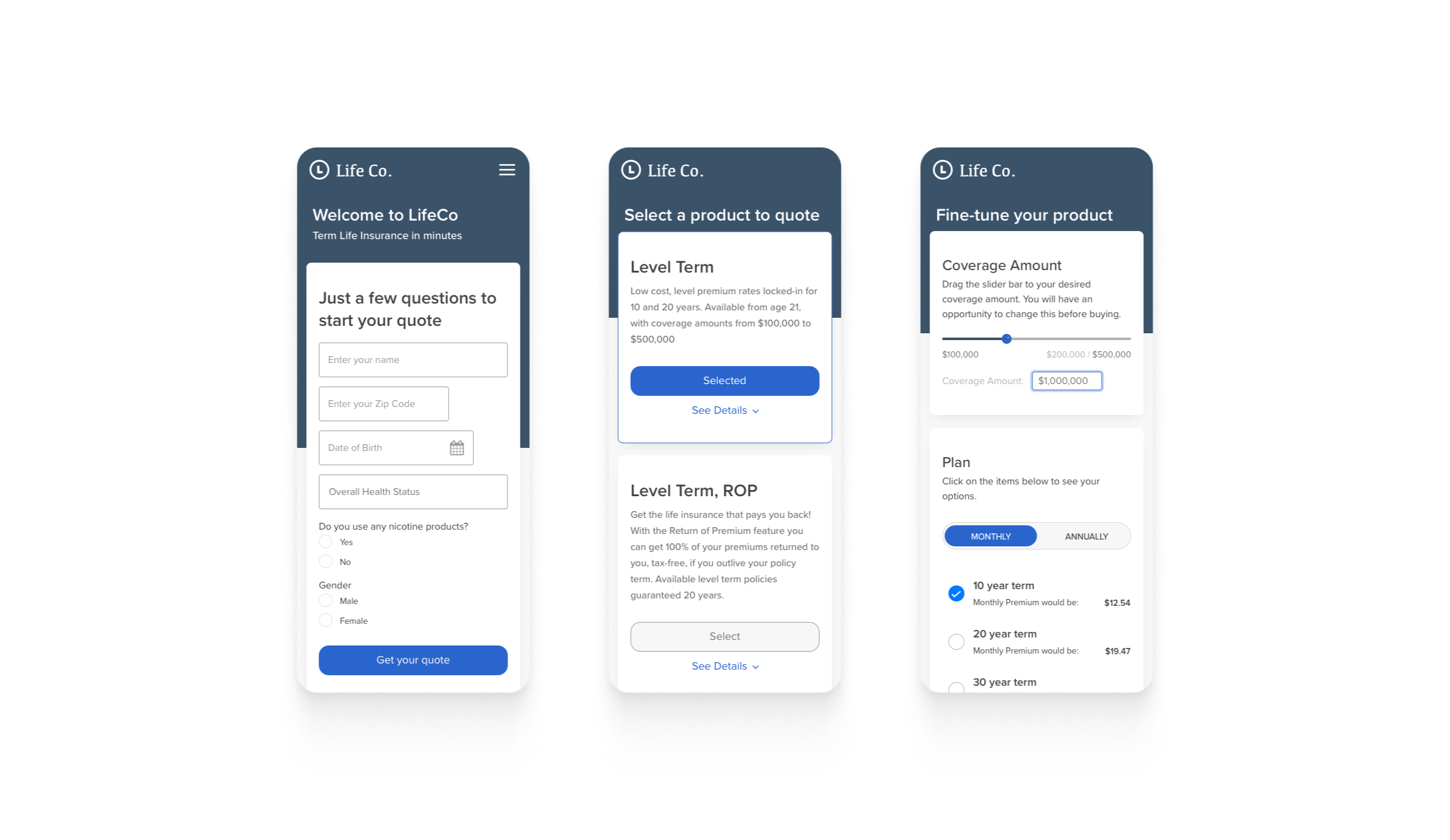
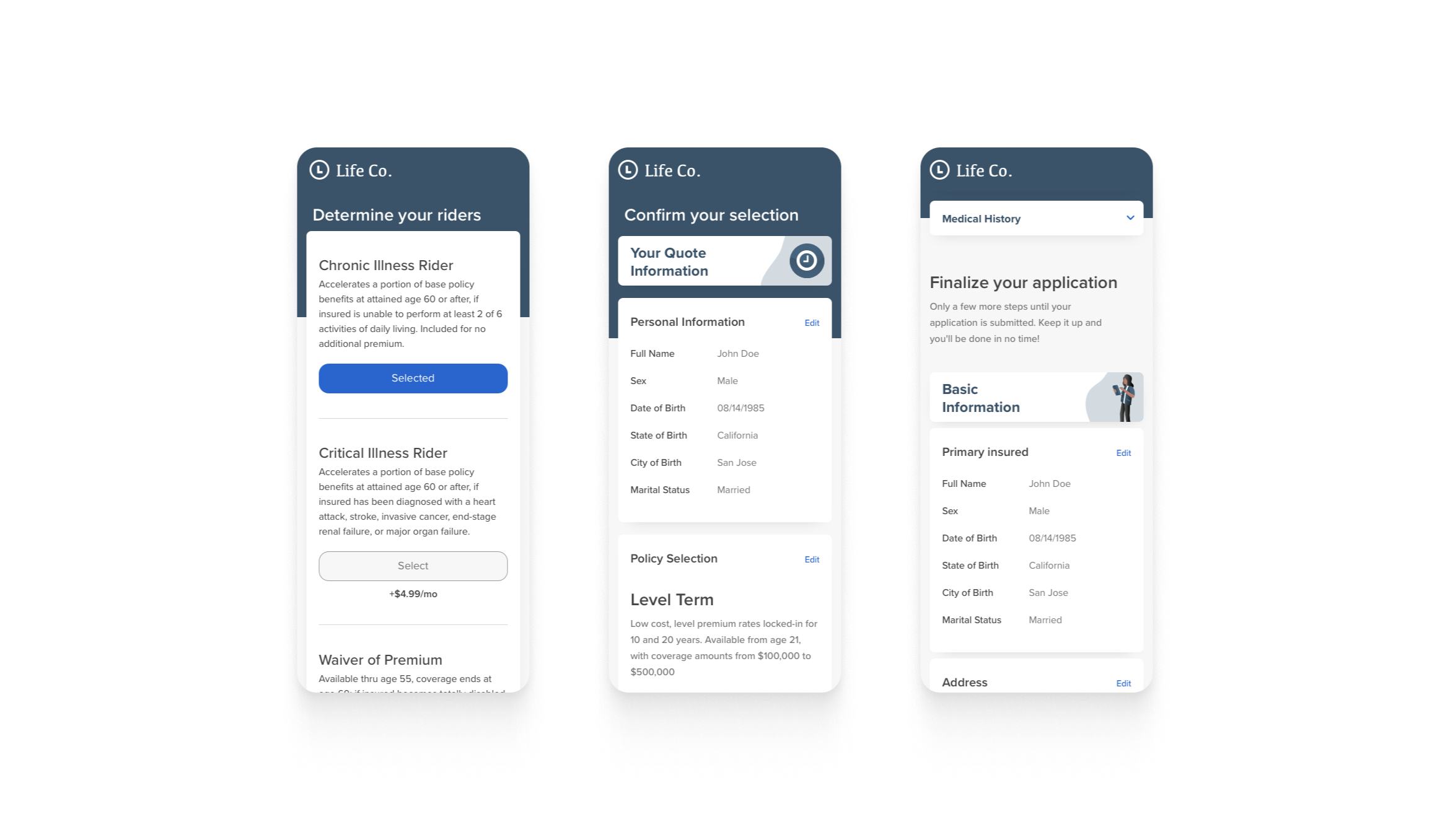
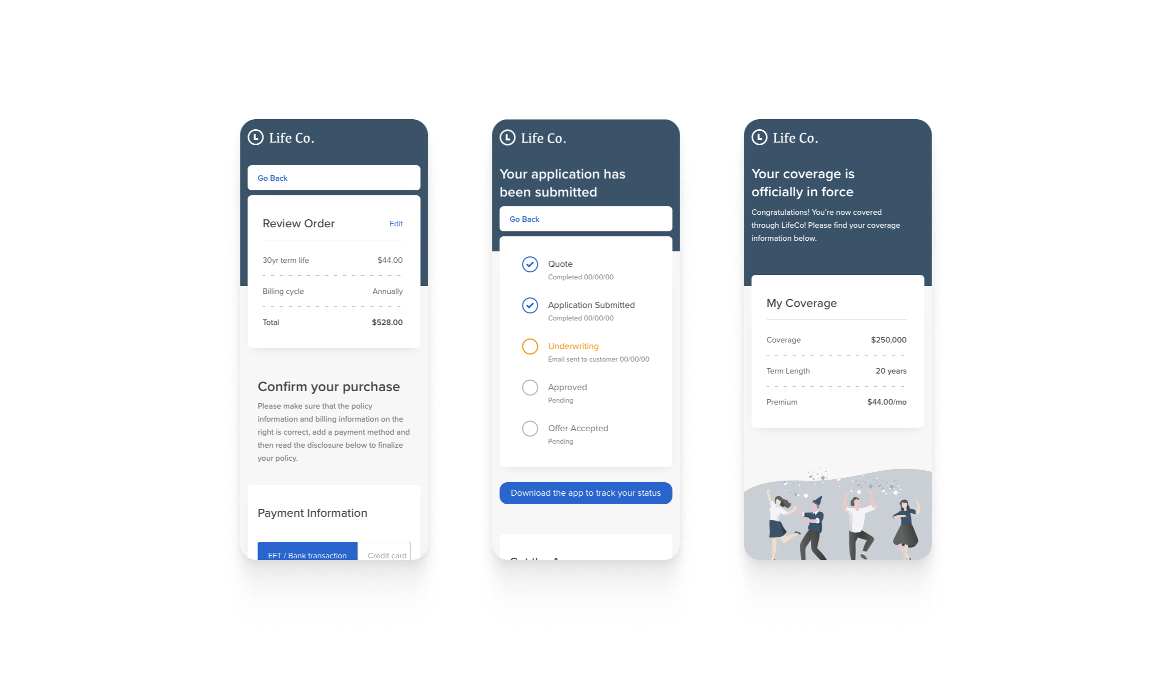
Mobile screens of the revamped quote and application.
Project Details
Challenge
Two years after launch, LifetimeAcquire showed serious flaws: it could only handle one policy type, had limited question formats, poor customization options, high support call volume, and unacceptable abandonment rates.
Increase conversion rates and improve user experience using usage data, while adding more white-label branding options for carriers.
Overview
Background
In 2018, Jacob and I built an online life insurance quote engine that gathered personal information, recommended products, and pre-filled application data.
Industry reports showed 74% of applicants wanted to buy online, but many carriers lacked direct-to-consumer applications. This put them at a disadvantage against startups using streamlined underwriting for certain policies.
We expanded the quote engine, drawing inspiration from tax software for question structures. LifetimeAcquire used two question types: basic and reflexive, with a system to handle unlimited follow-up questions.
Our initial launch with 4 carriers generated over $5 million in billing, but product flaws led to incomplete applications and high support calls.
Initiation
To fix these issues, assembled a team with tight constraints: 2 weeks, 12 developers maximum, and frontend-only changes.
Analyzing 2 years of data revealed that 70% of users accessed forms on mobile devices, and drop-off rates hit 53% for longer applications—confirming our "form fatigue" theory.

Discovery
Application Complexity
We found that short applications worked well with a question-by-question flow, but longer ones needed more structure. We redesigned to give carriers control over section organization, matching industry standards.
We also improved how basic and reflexive questions displayed within sections, reducing screen count and better showing completion progress. For mobile users with poor connectivity, we prioritized essential data and broke forms into smaller segments.

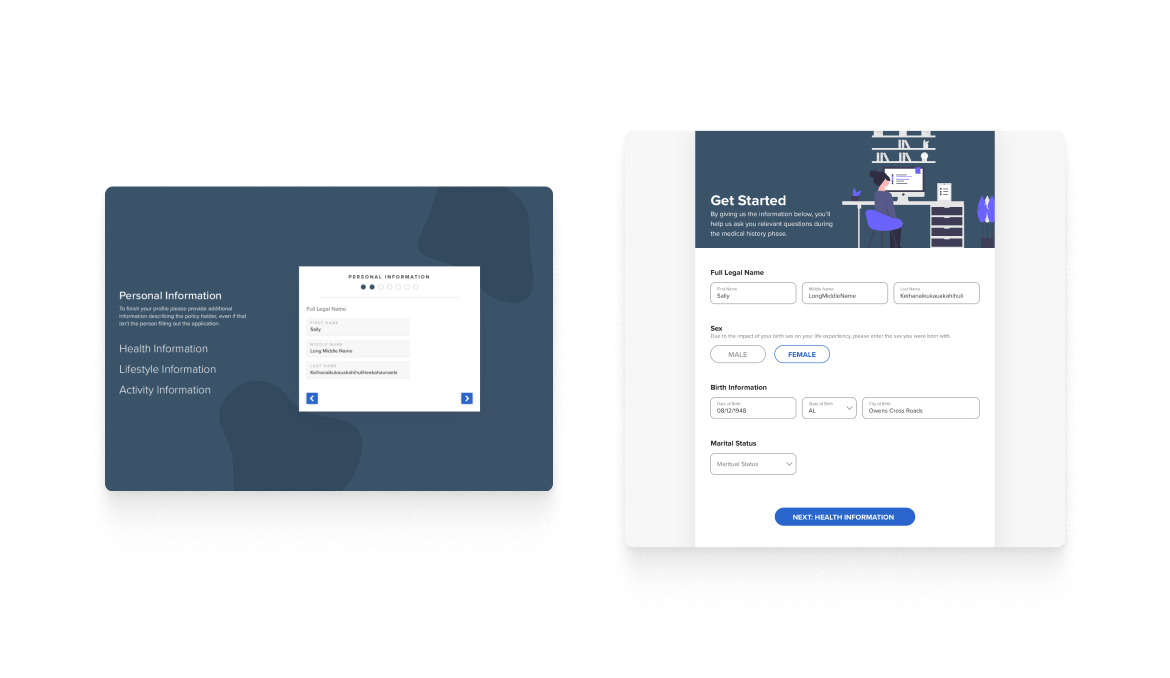
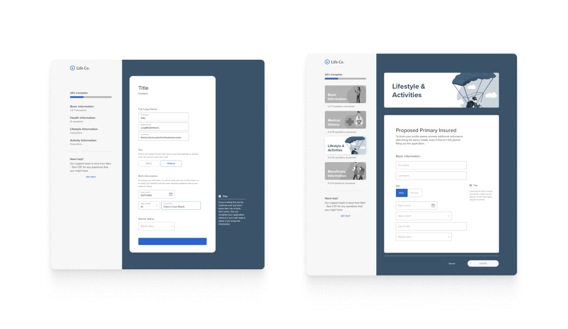
Original designs of the single-page acquire product.
This was a previous pass which showcased a split after the first encountered reflexive question and not the single-question per-page version of the application that was built.
Definition
Audience
Policyholders
Today's users expect to manage everything online, but applicants range from 21 to 85 years old with varying support needs. Many have visual or physical impairments or limited insurance knowledge.
Carriers
Insurance companies have been slow to go digital, lacking the expertise or structure to build internal software teams.
Agents / Call Center Representatives
Agents play varying roles in the customer experience depending on the product and purchase method. Call center reps, often licensed agents themselves, help with product selection, application support, and complex underwriting.
Underwriters
Underwriters evaluate policy risk and are part of the carrier user group. While they don't use the application directly, they benefit from applicant behavior data, like when users modify answers to adjust premiums or improve acceptance odds.
Earliest sketches of my ideas for the product revamp.We used half sheets of paper and sharpies to avoid getting too precious with the rough concepts.
Design
Updating Sections
We updated sections and questions to improve user experience and reduce drop-off rates while helping users better understand their progress.
The biggest improvement was cutting page count. The old version's excessive length made navigation difficult and progress unclear. Our new design showed entire sections on single pages instead of one question per page.
We explored different ways to structure and present information, then selected the most flexible design to support various white-label approaches. Vivek tested the design with fictitious branding to ensure it worked with different brand elements and identify areas needing refinement.
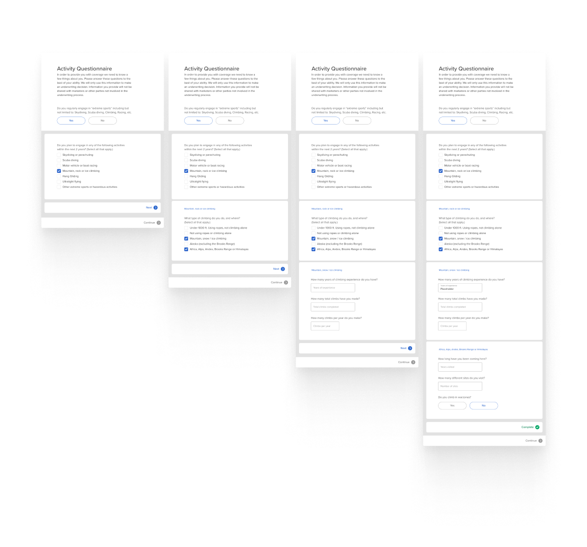


Improve Reflexive Question Rendering
Reflexive questions posed two challenges: helping users understand question relationships visually, and tracking answer changes for underwriting purposes.
Initially, each reflexive question spawned child questions that loaded until hitting another reflexive question. Engineering constraints forced us to scale back to one question per page.
The first version had complex nesting issues—child questions could have multiple parents and generate more children. We simplified this so each child had only one parent, using breadcrumbs to show relationships.
When we redesigned sections as full pages, reflexive questions needed to update the UI dynamically based on user responses.
Vivek and I created two wireframe approaches: one requiring answer submission to load questions, another loading automatically. Engineering's decision to track all answers on click simplified the UI significantly.
Our final design showed all questions inline with different colored card backgrounds to indicate groupings. Cards expanded when loading additional questions, creating a two-tier question hierarchy.

Component-Driven Design
White labeling was crucial since insurance products function almost identically—differentiation comes down to cost and terms.
Following a principle I championed, Vivek and I used component-driven design similar to how React works for developers. After wireframing our direction, we built reusable components first, then assembled them into pages and flows.
This let us make rapid design adjustments and spend more time with developers on frontend functionality. It also accelerated carrier branding during sales reviews.
The approach saved significant time and became the foundation for our company-wide design system, SureUI.
Prototype
While I managed multiple projects, Vivek built a functional prototype to showcase our ideas to carrier partners and demonstrate how the final product would work. We used it to conduct usability testing with potential applicants and communicate design specs to engineering teams, who could then suggest necessary modifications.
Updated UI

We redesigned the quote flow by breaking it into clear steps with supplemental information to help customers understand different policy types and choose the right price point.

The web application updates kept important forms prominent while providing clear navigation and a modern UI. We maintained inline editing to make corrections easier for applicants.
Impact
After finalizing the design, our engineering teams built the product. We worked together to ensure it met all specifications, using data from our design partner AAA to verify functionality and quality standards.
The improvements significantly reduced customer drop-off before submission and let Sureify offer multiple experience options tailored to each carrier's business needs.

Interested in working together? Contact me!
© Anders Houston 2024